The Lio Method
Color
Like most design systems, Lio understands color as a coin with two sides.
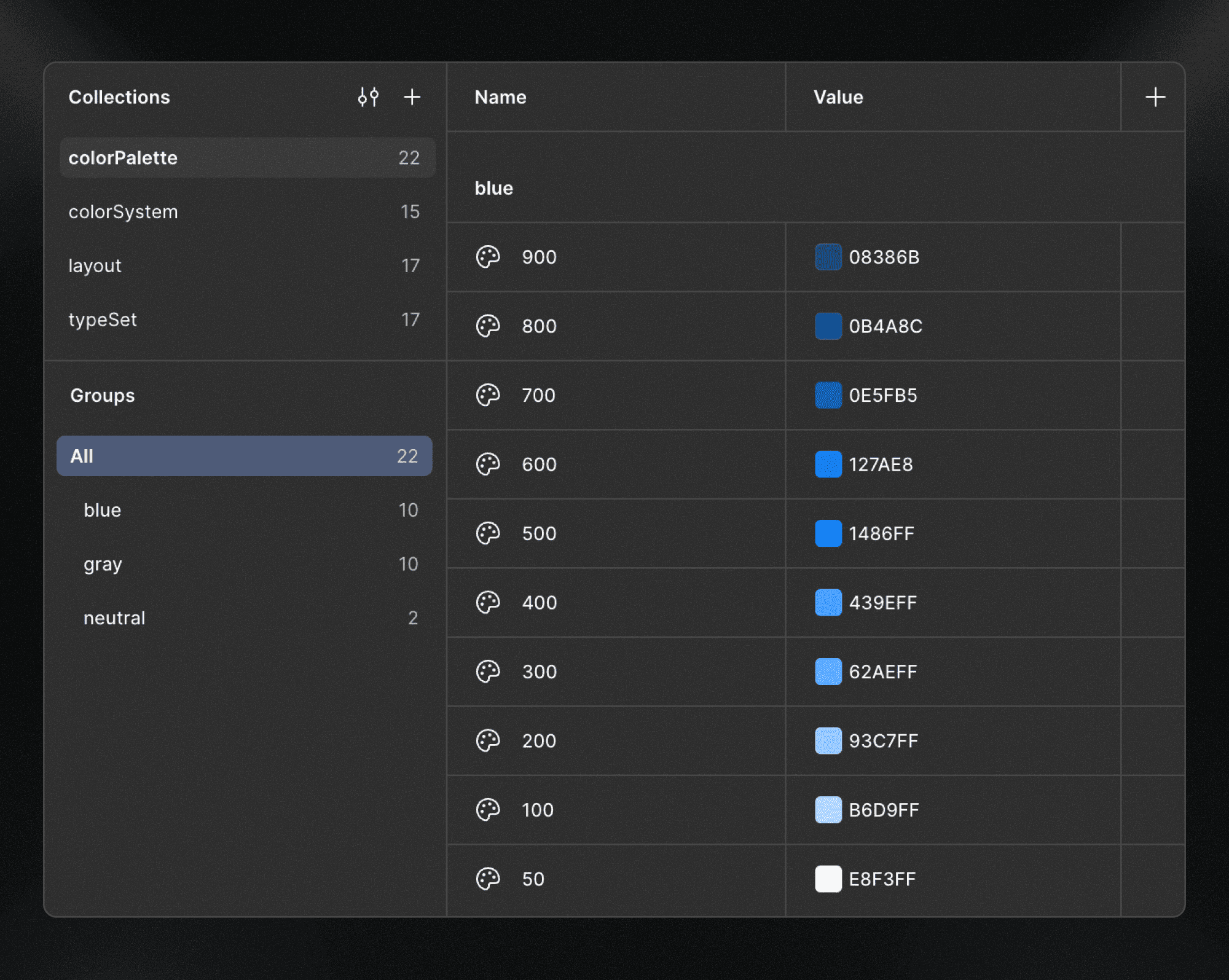
colorPalette
The colorPalette is the foundation side of the coin focused only on color raw values, not on design decisions.
When defining palettes, colors are organized by groups (one group per color) using a numeric scale from 0 to 1000, where 0 represents white and 1000 represents black.
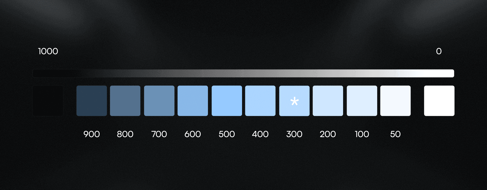
To avoid overcomplicating each palette, a dedicated neutral group is introduced exclusively for black and white values instead of duplicating them across every palette.
Check this article on how to generate accessible color palettes using the LCH color model, and why the color-500 isn’t necessarily the key color of the palette as you can see in the example above.
Application
When setting up a Figma project, Lio Toolbox generates three color palettes as placeholders, providing a clear example of the expected structure:
A brand color palette
A gray palette
A neutral palette (black & white)
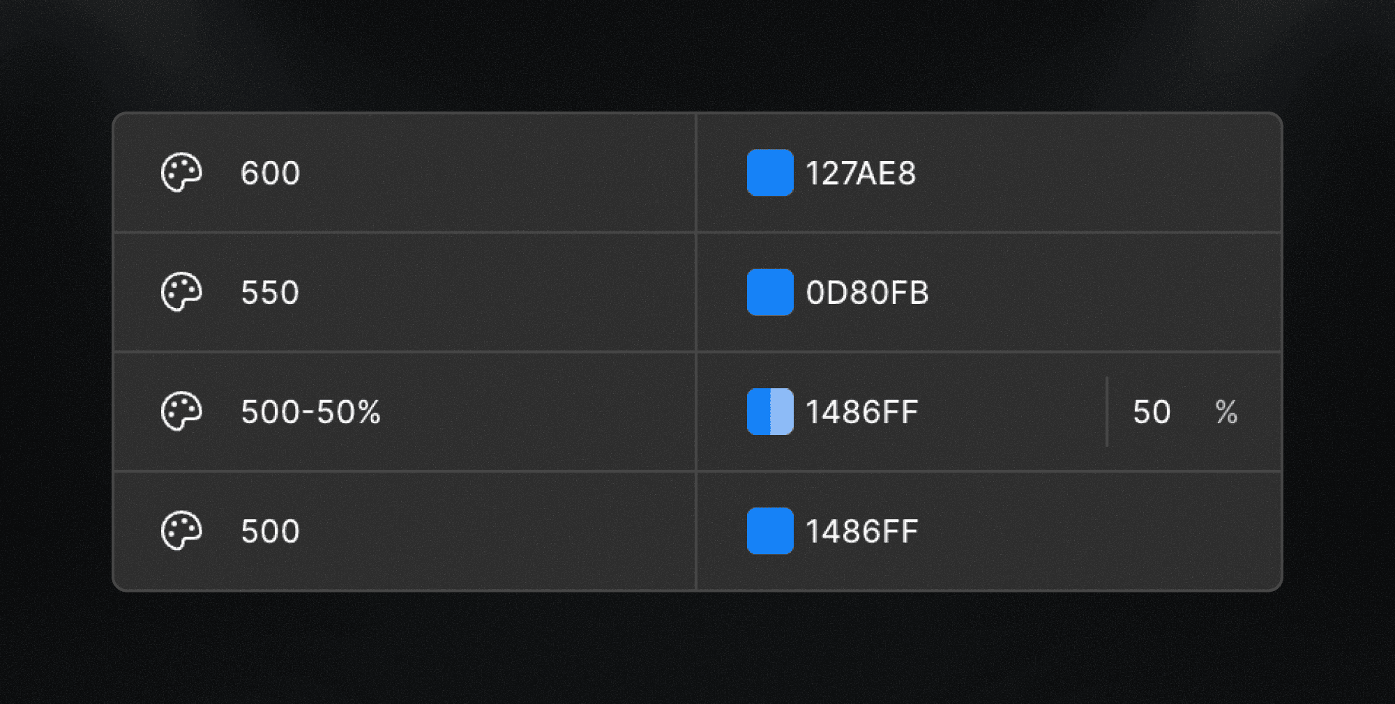
Palette scalability
You can add as many colors as your project requires. The naming convention is intentionally flexible, allowing you to introduce additional tints or shades when needed.
For example:
An intermediate value between tonal steps (e.g.
500,550,600)A variation with a modified opacity (e.g.
500-50%)
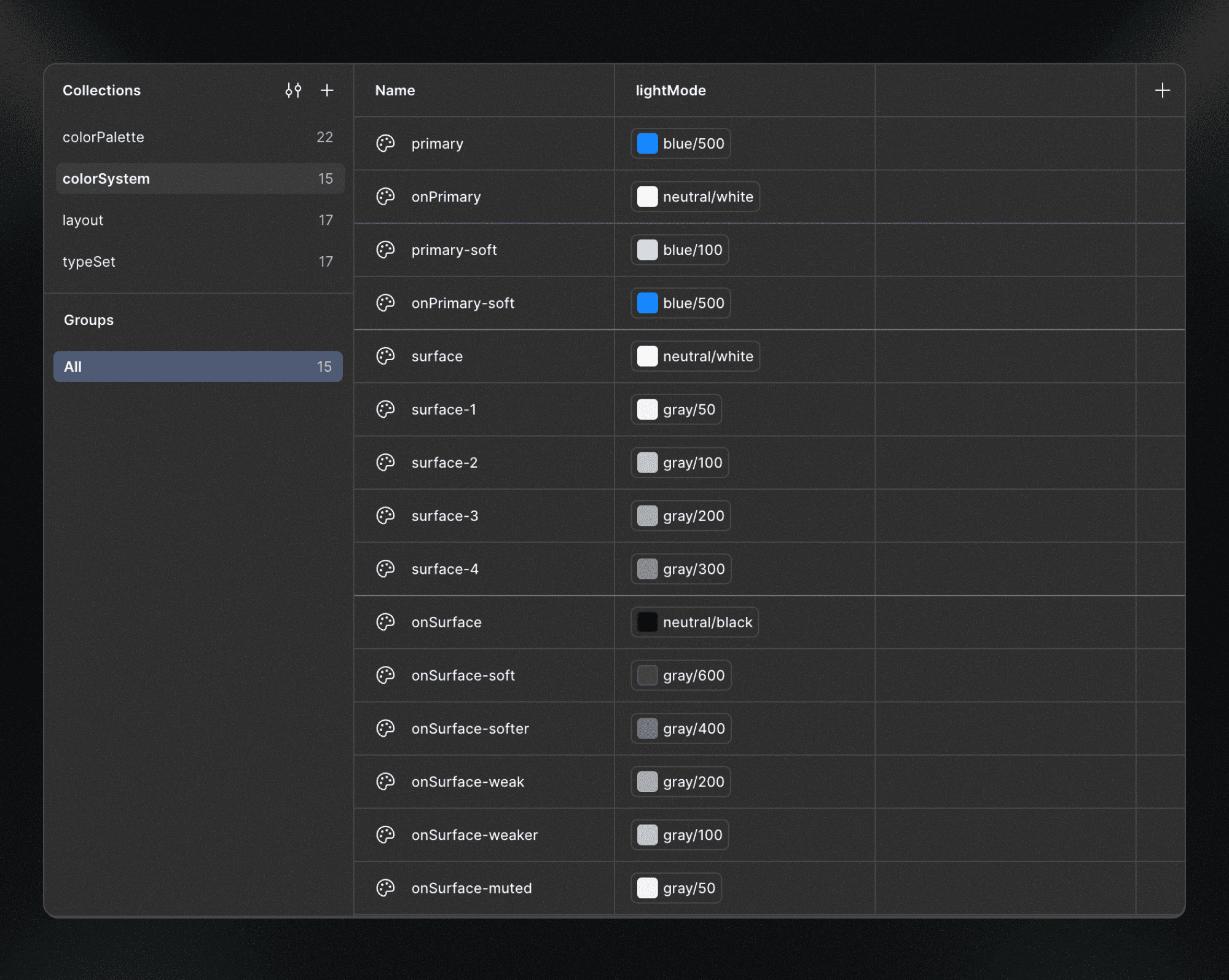
colorSystem
As we’ve seen, many traditional design systems split color decisions into multiple semantic groups and sub-groups, defining specific tokens for text, borders, strokes, backgrounds, brand colors, and more.
While this approach is powerful, it assumes that interface roles are clearly defined from day one, branding and UI semantics remain stable, and use cases are fully known in advance.
In web projects, this is rarely the case.
Design systems often take shape in parallel with visual exploration and web production, not before them.
Instead of defining color tokens by UI role, the Lio Method adopts a contextual color model inspired by Material Design, based on contrast and hierarchy.
This approach provides a simple yet powerful way to systematize color decisions in an organized and scalable manner.
How it works
The core idea is straightforward:
There is always a surface, and there is always something placed on top of that surface.
This mental model allows color decisions to be grouped naturally, without relying on rigid UI semantics.
From this perspective, Lio defines two primary color contexts:
surface: background layers
onSurface: elements placed on top of a surface (text, strokes, icons, components, etc.)
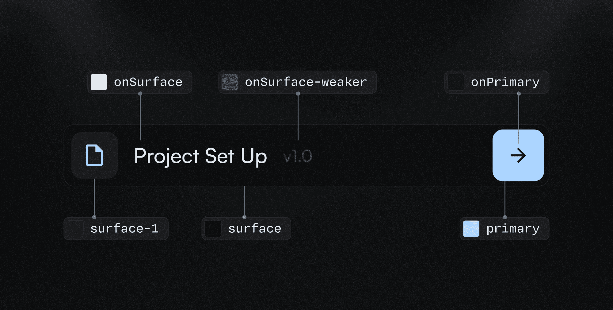
Application
When setting up a project, Lio Toolbox generates a dedicated variable collection as a placeholder for these decisions, providing a clear and practical example of the expected structure.
You can delete the placeholder structure and build your own variables gradually as the project evolves. This is actually the recommended approach once you understand the naming logic.
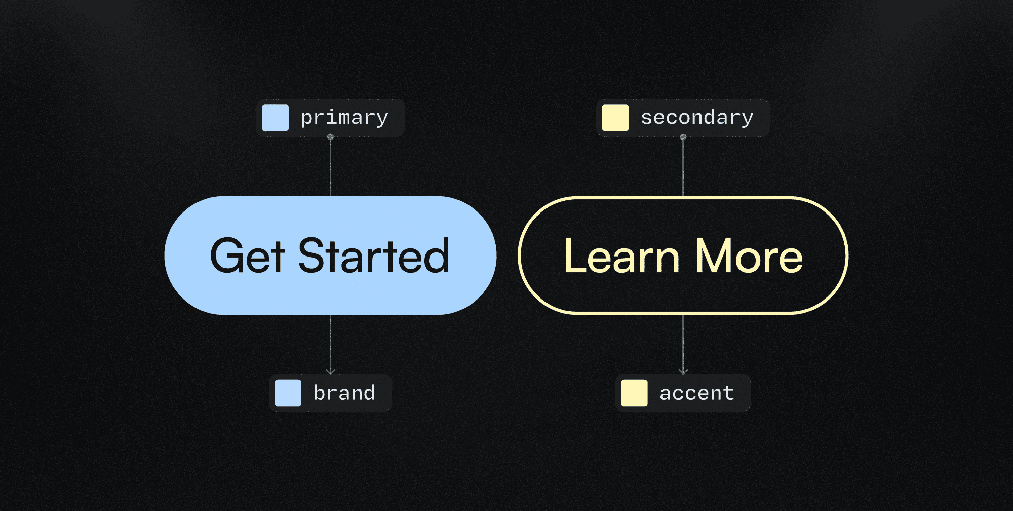
Brand colors
The same surface / onSurface logic applies here.
However, since brand colors represent a specific and singular context, the concept of surface is replaced by the brand color name itself, such as primary, secondary, or tertiary.
As a result, brand color tokens follow the same contextual structure, using the brand color as the base surface.
This allows you to define combinations such as:
Note: The modifiers can be defined by appending the
-modifiersuffix to the base token name.
Surface colors
Surface tokens (which represent background layers) are organized from 0 to infinity. The higher the number, the higher the elevation level.
This means, for example, that a banner component using surface-2 inside a section using surface-0 is visually considered on top of the section background.
The expected structure is:
Note: Since
surface-0is the default value, the-0suffix is intentionally omitted for practical reasons.
On surface colors
Unlike surface colors, onSurface tokens are organized semantically by emphasis, not by elevation. The default value represents the strongest contrast, and each variant progressively reduces emphasis:
Lio intentionally uses the concepts strong and weak instead of light and dark.
This distinction is important because the system is compatible with both light and dark modes, and using “light” or “dark” would introduce ambiguity.
By naming emphasis explicitly, onSurface tokens remain:
Mode-agnostic
Predictable
Easy to reason about
Consistent across themes
System scalability
Brand colors
Roles with deeper hierarchy:
Starting with primary and secondary is a solid foundation.
Once the brand direction is clearly defined, you may choose to move toward more explicit role names that reduce ambiguity — especially when working with teams.
You can transition from primary / secondary to brand / accent to improve clarity and communication around design decisions.
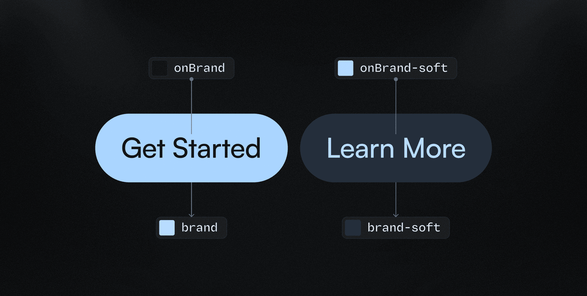
Adding modifiers:
You may need to introduce additional tokens depending on context or usage.
In those cases, modifiers can be added by appending a descriptive suffix (-modifier) to the base token name, making the decision explicit and reusable.
For example:
onPrimary-soft/primary-softrepresents a lighter tonal variation of the brand coloronPrimary-strong/primary-strongrepresents a stronger, more emphasized variation of the brand color
You can define as many variations as needed, following the same semantic naming logic used by onSurface tokens (soft, softer, weak, weaker, muted).
Multi-color brands
For brands with multiple key colors, it’s not recommended to use color-specific names such as red or onRed. If the brand goes through a rebrand and, for example, red becomes green, the token name would no longer reflect its purpose, resulting in a red token holding a green value.
In these cases, it’s better to use role-based naming conventions, such as:
coreonCorecore-2-softeronCore-2-softercore-3-weakonCore-3-weak
You can choose the base term that best fits the project’s needs — or what feels most comfortable if you’re working solo.
Recommended base terms include:
primary(alone, or alongsidesecondaryandtertiaryfor slightly more complex systems)coremainbrand
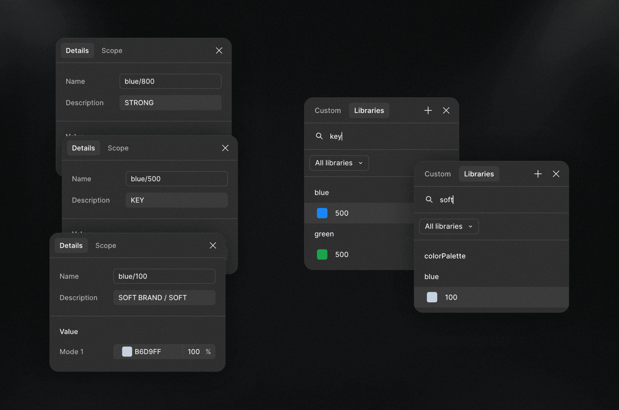
As an alternative for simpler projects, colors can be referenced directly from the colorPalette.
When doing so, you can take advantage of Figma’s variable metadata, using descriptions or comments to add contextual keywords such as:
KEYSOFTSTRONG
This approach keeps the system simple while preserving clarity and intent.
Black-and-white brands
For brands without a defined color palette, you can omit brand color tokens entirely and rely only on surface / onSurface variables.
This works well for very minimal systems.
However, the recommended approach is to still define primary / onPrimary tokens for flexibility.
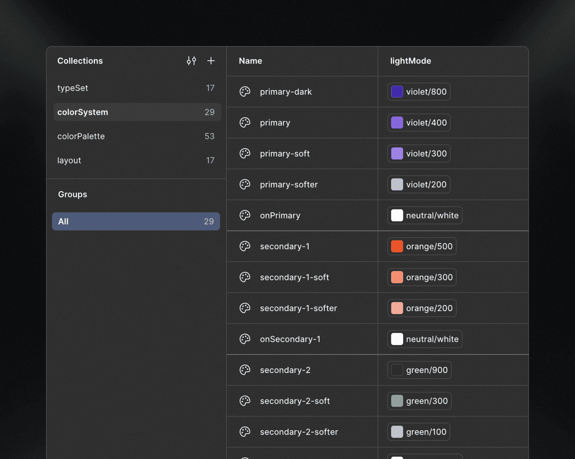
For example, a button may use:
A black background with a white label (
primary/onPrimary)While body text uses
onSurfaceon top of asurface
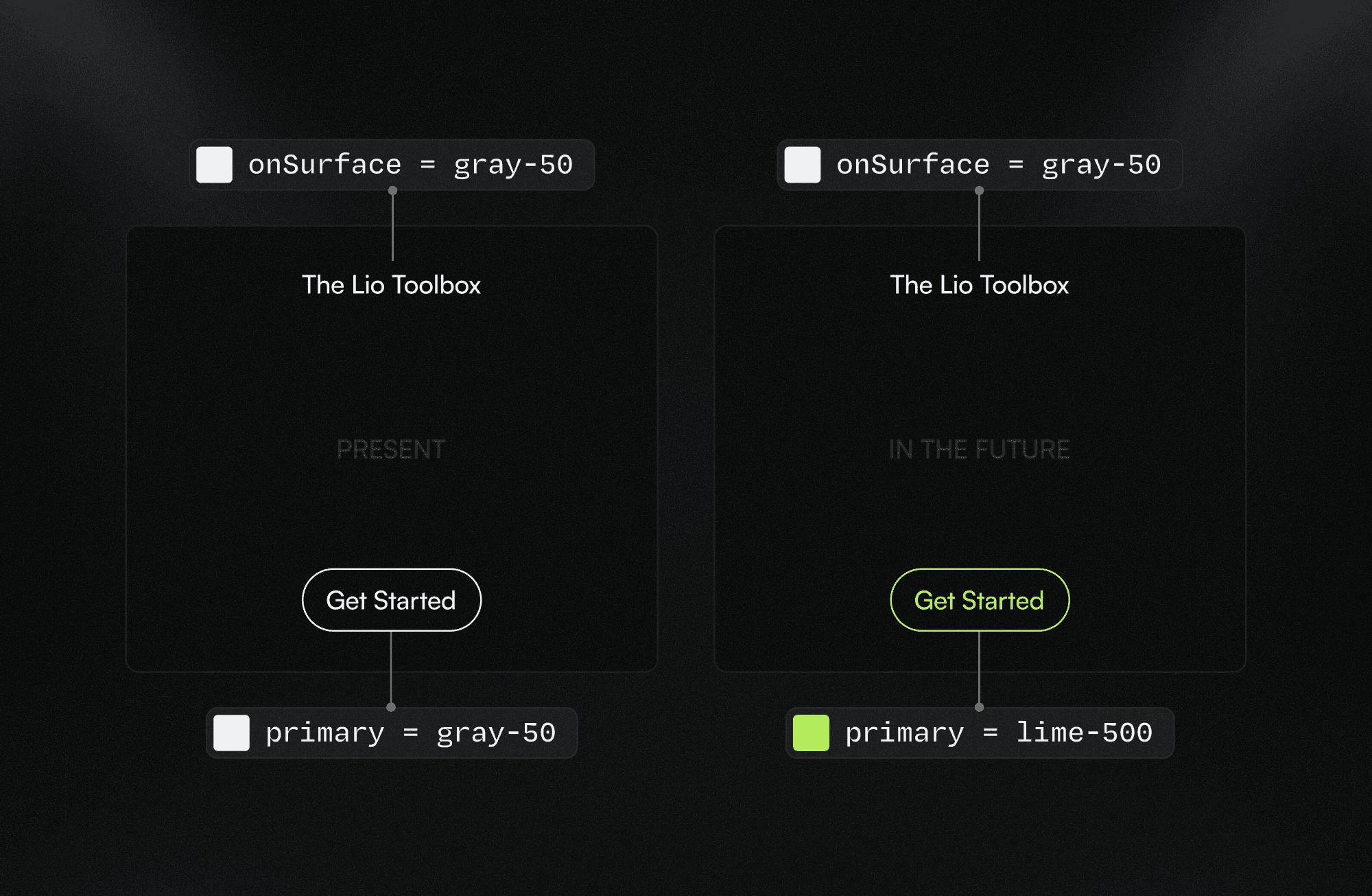
Even if the raw color values are the same, these are conceptually different use cases, and separating them at the system level preserves intent and future scalability, as you can see in the image above.
onSurface colors
The default onSurface scale includes six levels of emphasis: the base value + five variants.
In most cases, this range is more than enough to cover hierarchy, contrast, and accessibility needs.
If you find yourself needing more than six variants, it’s often a signal of inconsistency rather than complexity.
Before extending the scale, review your design decisions and evaluate whether some use cases can be unified under fewer emphasis levels.
A growing scale should reflect real needs, not compensate for unclear decisions.
Introducing project-specific tokens
If the existing scale feels insufficient, it’s often because the design is starting to require greater specificity, not more emphasis levels.
In those cases, instead of extending the base scale, you can introduce project-specific tokens that capture unique design decisions, even when they reference the same raw values.
Examples include:
gridLineoutline-dotborderctacomponent-level contexts (e.g.
button,onButton)modifiers such as
-primaryor-secondary
These tokens should remain intentional, limited, and tied to real use cases within the project.
For example, if all action components are meant to use the brand color, there’s no need to distinguish between a text link and a button.
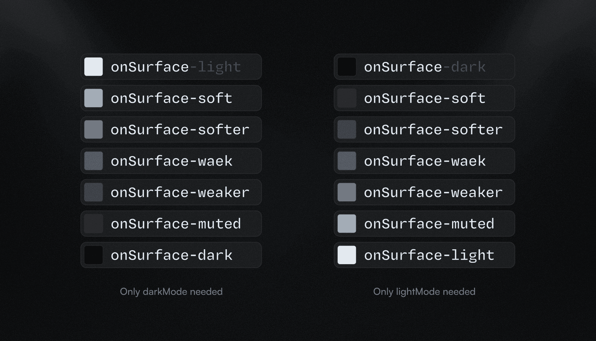
The onSurface-light/dark token
Figma offers powerful theming capabilities, but not every project requires multiple modes such as a full darkMode.
In some cases, a project may only need white or light-colored text on top of dark or highly contrasted surfaces, or the opposite: a fully dark-mode interface, without introducing a full theme variation.
In these scenarios, you can introduce a dedicated token such as onSurface-light, and optionally rename the default token to onSurface-dark to make the distinction explicit.
This allows you to:
Keep contrast decisions clear
Avoid premature theming complexity
Preserve semantic intent
If the project later scales and requires a proper dark mode, you have two options:
Reuse
onSurface-lightas the inverted value in dark modeRemove it entirely if the default
onSurfacedarkMode value covers the use case
Important: Be mindful of how extensively this token is applied. If it’s widely used, replacing it manually can introduce errors.
In those cases, it’s recommended to use Figma automations or console scripts to safely migrate values. For example, finding all instances of onSurface-light and replacing them with onSurface in the appropriate mode.
surface colors
The surface system is highly flexible, since elevation levels are expressed numerically.
However, it’s recommended to keep the scale within six variations by default. In most cases, this range is enough. If it isn’t, it’s often a sign of inconsistency rather than real complexity, and you should first review whether some surface decisions can be unified.
If, after reviewing, the project genuinely requires more levels, the system allows you to extend the scale safely.
Adding in-between values
By default, surface levels follow a simple numeric sequence (1, 2, 3, 4).
This works well for most projects.
For more complex layouts, you can switch to a two-digit scale (10, 20, 30), similar to colorPalette.
This allows for intermediate values when needed:
surface-10surface-15surface-20
This approach increases flexibility without breaking existing structure.
Adding semantic values
In some cases, certain surfaces carry specific functional or contextual meaning, such as banners, containers or pop-ups.
Instead of introducing more numeric levels, you can add semantic surface tokens:
surface-disabledsurface-hoversurface-activesurface-focus
You can either apply them using a -modifier, or use the semantic project-specific surface token:
highlightbanneroverlaycontainer
Semantic tokens should be used sparingly and only when the surface represents a consistent, reusable concept across the project.
Other colors
In addition to surface and brand colors, some projects require functional or state-based colors to communicate system feedback and UI states.
These colors are not part of the core brand or surface logic, but represent specific meanings that should remain consistent across the interface.
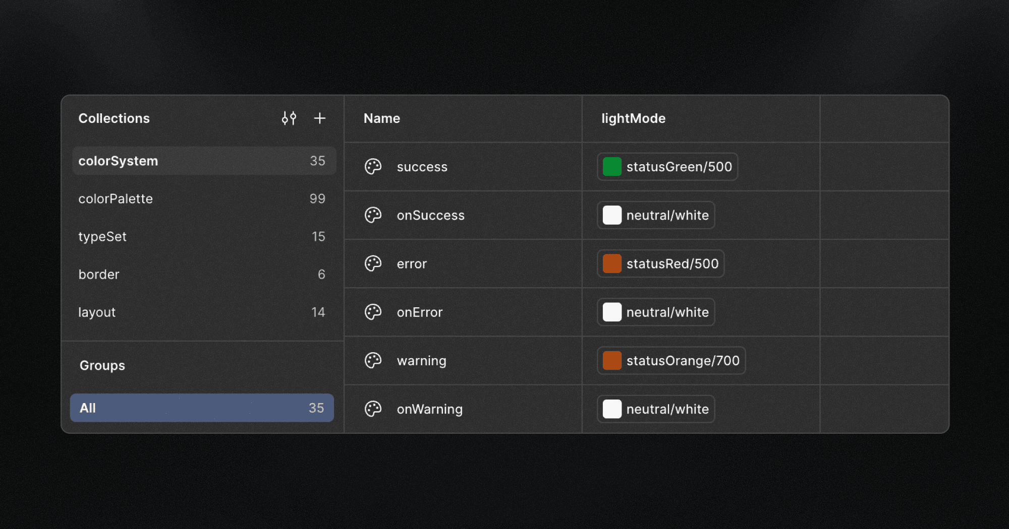
Status colors
Status colors are used to communicate feedback, intent, or system state.
They follow the same contextual logic used throughout the Lio Method: surface → onSurface.
A basic setup may include:
success/onSuccesswarning/onWarningerror/onErrordisabled/onDisabled
These tokens should be introduced only when the project requires them, and not by default.
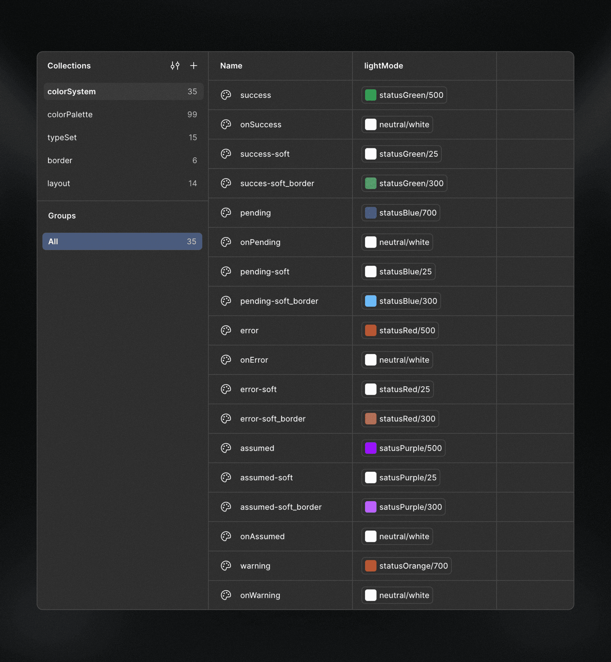
Extending status colors
As the project scales, status colors can be extended using modifiers, following the same semantic naming patterns already used in the system.
Examples include:
Tonal variations
success-softwarning-softerror-soft
Usage- or context-based variations
success-bordererror-border
Interaction states
success-hover/onSuccess-hovererror-hover/onError-hover
Modifiers should remain descriptive, limited, and meaningful, reflecting real use cases rather than speculative needs.
Any other questions? Get in touch.