The Lio Method
Typography
Is not about picking sizes. It's about communicating hierarchy and intent.
Type scale vs. type system
A type scale defines the range of font sizes available in a project.
A type system defines how, when, and why those sizes are used.
In traditional systems, these two concepts are often tightly coupled. The Lio Method intentionally keeps them slightly separated to preserve flexibility.
The scale defines the scope and the system defines the decisions.
Naming convention
Typography naming in Lio is aligned with the Refokus Webflow Class Naming Convention, where text styles are divided into two main categories:
c-title-#— for headingsc-text-#— for body and paragraph text
In addition, combo classes are used for modifiers and variants, such as:
cc-boldcc-italiccc-all_caps
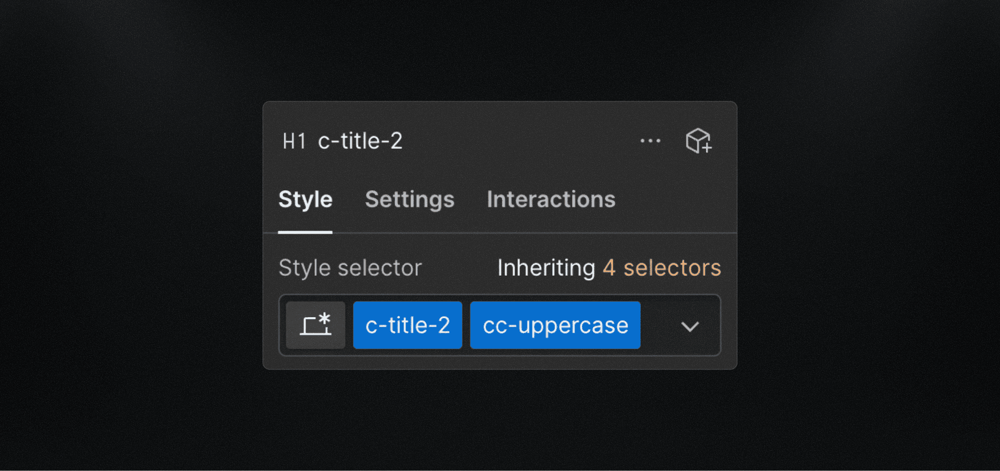
Why c-title instead of H1, H2, etc.?
Headings such as H1, H2, H3 define structure and markup — not style.
In real projects:
An H1 may visually look like a subtitle
A hero title might be an H2 semantically
Visual hierarchy changes across breakpoints
For this reason, Lio avoids tying typography styles directly to HTML semantics.
A semantic <h1> element may perfectly use a
c-title-2style, as shown in the example image.
This distinction improves flexibility while keeping structure and accessibility intact.
The Lio type scale
The type scale proposed by The Lio Method is intentionally simple.
To reduce visual noise in naming, the c- prefix is omitted. This keeps text styles compact and easy to use in Figma.
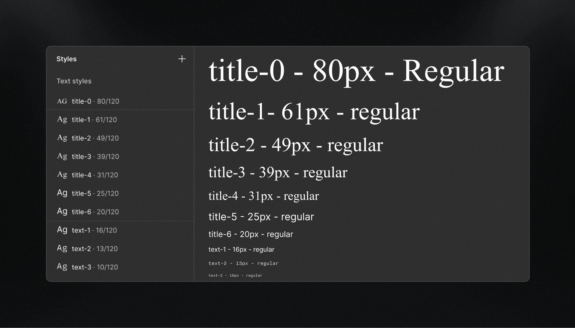
At this point, this behaves more like a typographic scale than a full typographic system—and that is intentional.
The goal is to give designers the freedom to explore hierarchy first, and only formalize patterns once they prove useful and repeatable.
From scale to system: modifiers
The intention layer is introduced through modifiers.
Modifiers allow you to capture common and recurring typographic patterns in web design, such as case, weight, or functional role without inflating the base scale or fragmenting the system.
In this case, the cc- prefix is replaced by a simple .
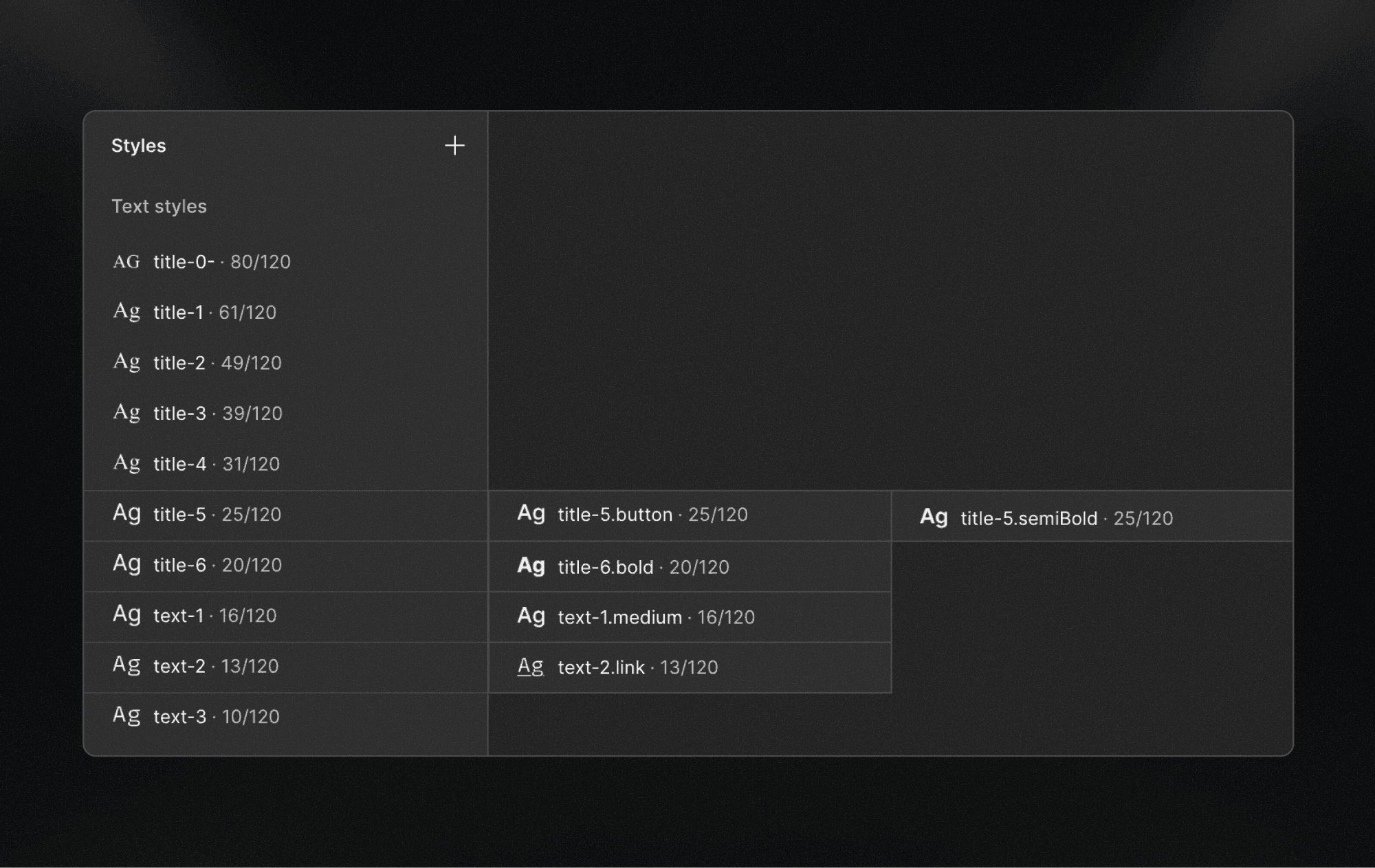
This approach allows teams to:
Preserve a small and stable base scale
Encode intent only where it adds value
Avoid creating dozens of near-identical text styles
Text style composition
Each text style in Lio is composed of several properties:
fontFamily , fontWeight , fontSize , lineHeight and letterSpacing.
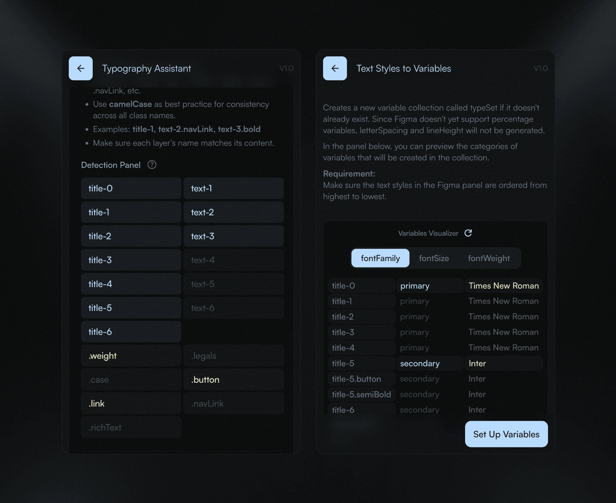
Lio Toolbox automates the creation and application of Figma variables for most of these properties.
Why line-height and letter-spacing are excluded
On the web, typography is fluid and dynamic. line-height and letter-spacing are often expressed as relative values (%), not absolute ones.
Since Figma variables do not currently support percentage-based values for these properties, they are intentionally excluded from the variable system and managed directly at the style level.
This ensures:
Better parity with production code
Fewer false abstractions
More accurate previews
Adaptability
The type system in The Lio Method is not “scalable” in the traditional sense, because it already offers a high degree of built-in flexibility. Most web typography systems typically operate within 8 to 10 scale steps. Lio, by contrast, comfortably supports up to 13 levels, and can be extended to around 15 when a project requires it (and that’s very unusual).
That said, as a project grows, you may start to notice longer or more specific style names. This is expected.
Rather than enforcing a rigid structure, the typographic philosophy of The Lio Method is designed to adapt to the needs and complexity of each project, without breaking its internal logic. Below are a few ways you can approach your type system when scaling becomes necessary:
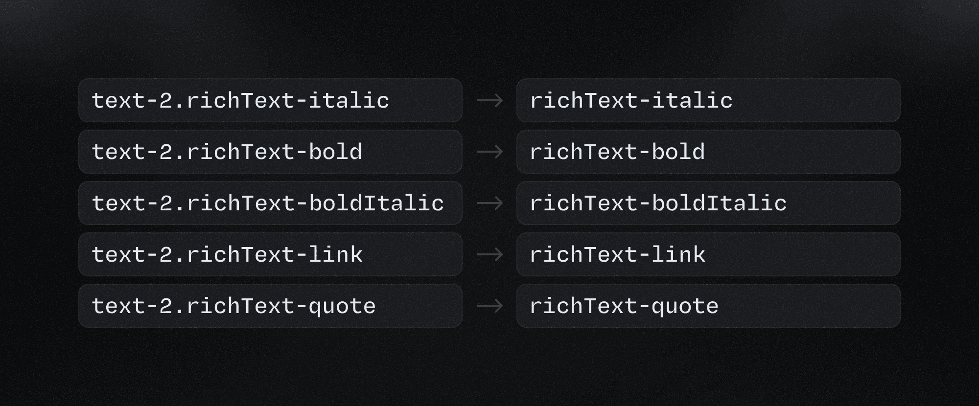
When modifiers become roles
If a style name starts to feel too long—for example text-2.richText-boldItalic—that’s usually a sign that you need to shift toward role-based style names.
Instead of encoding everything into a single chain, you can promote the modifier to a role and simplify the structure. The same example could then become richText.boldItalic.
You can also apply the group concept here, using the role as the group name and the variations as individual styles.
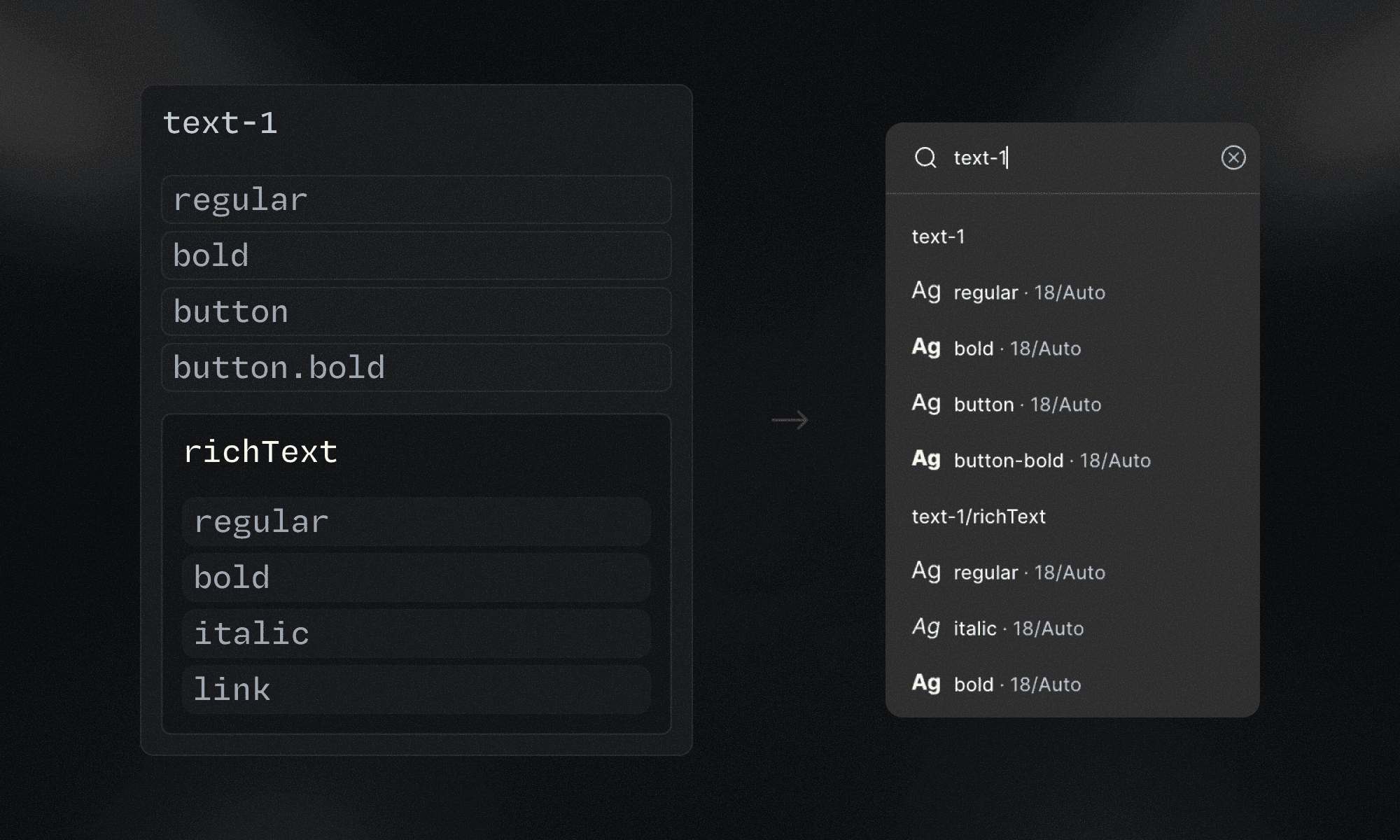
In The Lio Method, base text styles such as text-2.button remain semantic and role-based, rather than organized by font size. However, many designers still rely on font size as a primary reference when selecting a text style, especially during early layout and hierarchy decisions.
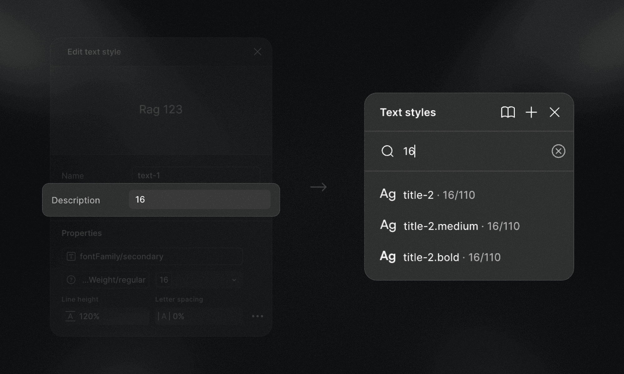
Something Lio Toolbox automatically does when text variables and styles are created is to put the font size value in the style description. This ensures that styles can be discovered either by functional role or by font size, depending on the context and the designer’s mental model.
About responsiveness
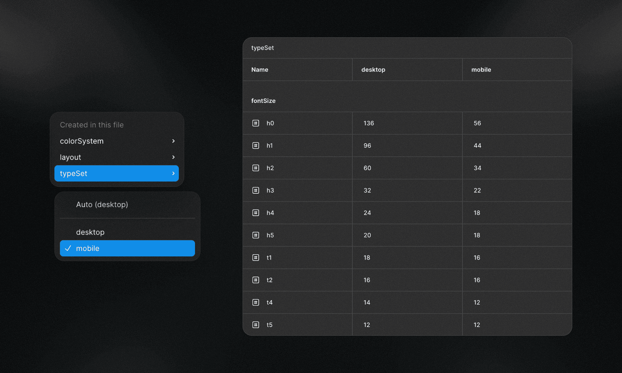
In The Lio Method, the typographic scale and system are designed by default for desktop. The preferred reference breakpoint is 1440px, as it provides enough space to define hierarchy, rhythm, and relationships without introducing early constraints.
Responsiveness in The Lio Method is handled through Figma variable modes. Once text styles are converted into variables (thanks to Lio Toolbox automations) adapting typography to different breakpoints becomes straightforward. As a project evolves, additional modes (tablet, mobile, etc.) can be introduced, adjusting only the values that need to change while keeping the overall structure intact. This preserves consistency while allowing the system to adapt naturally across contexts.
At the moment, Figma does not support percentage-based values for line-height and letter spacing. Because of this limitation, these properties are not managed through variables in the same way as font size. When line-height or letter spacing needs to change across breakpoints, The Lio Method defines two clear ways to handle it.
One option is to introduce breakpoint-based groups. In this case, a group named after the breakpoint, such as mobile, is created, and the modified styles are placed inside that group. This approach works well when multiple properties change together and need to be clearly isolated.
The second option is to encode the breakpoint directly into the style name using prefixes. For clarity and readability, The Lio Method favors slightly longer prefixes over single-letter abbreviations:
ta-for tablet
mo-for mobile
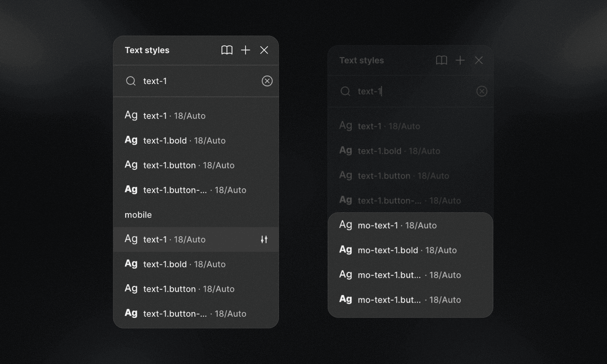
Using more explicit prefixes improves scanability and reduces ambiguity, especially in large style lists but you can choose to use the t- and m- simplified versions.
Both approaches are valid within The Lio Method. What matters most is consistency: once a strategy is chosen, it should be applied across the entire typographic system. The goal is not to create separate systems per breakpoint, but to adapt a single typographic system to different contexts without losing clarity, intent, or structure.
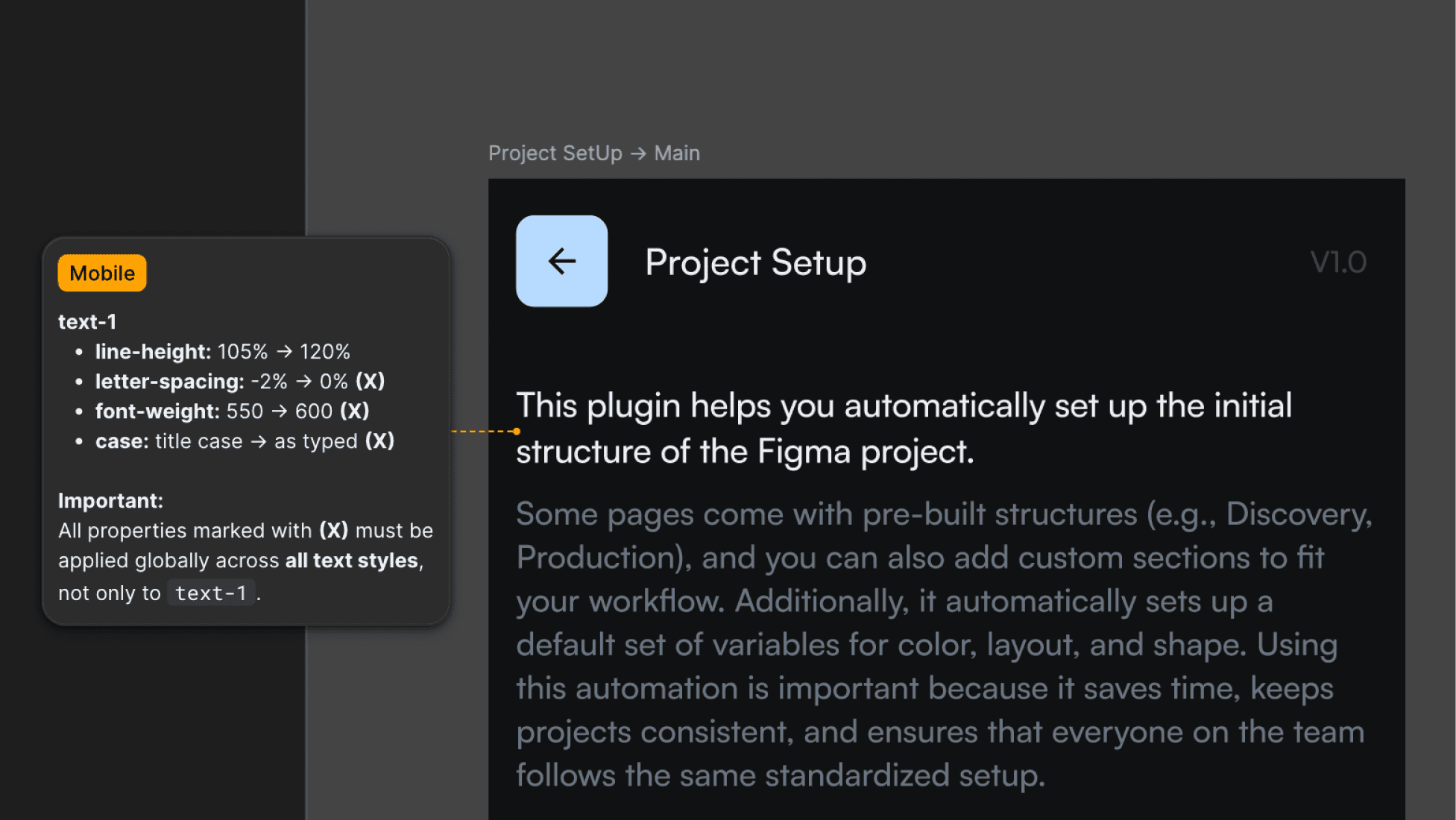
Important: It’s not always necessary to create responsive modified text styles.
Sometimes we design simply to deliver. In those cases, there’s no need to over-engineer the system when the adjustment can be resolved through the most appropriate communication model, such as a clear handoff using a Figma annotation with the values to adjust.
Any other questions? Get in touch.